Project Corporate Identity Design Documentation
Brand Space Cats Pvt Ltd, Brisbane Australia
Business Type Exhibition Design Studio.
Collaterals Brand logo, Allowed Variations, Colour Palette, Fonts and Stationery
Type Independent Project
Competition Analysis

Mostly all exhibition design studios use 3D, pictorial or abstract iconographic logos.
Most of the competitive logos use either black and white or a maximum of three colours.
The line quality in the existing logos is dynamic, hard and structural.
They create a mental response of a space.
Brainstorming


Initial ideas were thought of, keeping in mind the research and the brand name.
Since the very beginning of the ideation the designer was going for an illustrative or a typographical logo, just like the competitive organization’s logos.
Also since the initial stage itself, the designer chose an illustration of a cat and a space of any kind to make the logo. This combination was used in almost all the initial ideation and logo variations.
Shortlisting Ideas
I further shortlisted a few logos and made those digitally on Adobe Illustrator.

Finalised Logo Variations
I made more variations of the finalized logo, to understand which form, line quality etc would look the best.

After a lot of discussions and feedback the final logo was decided.

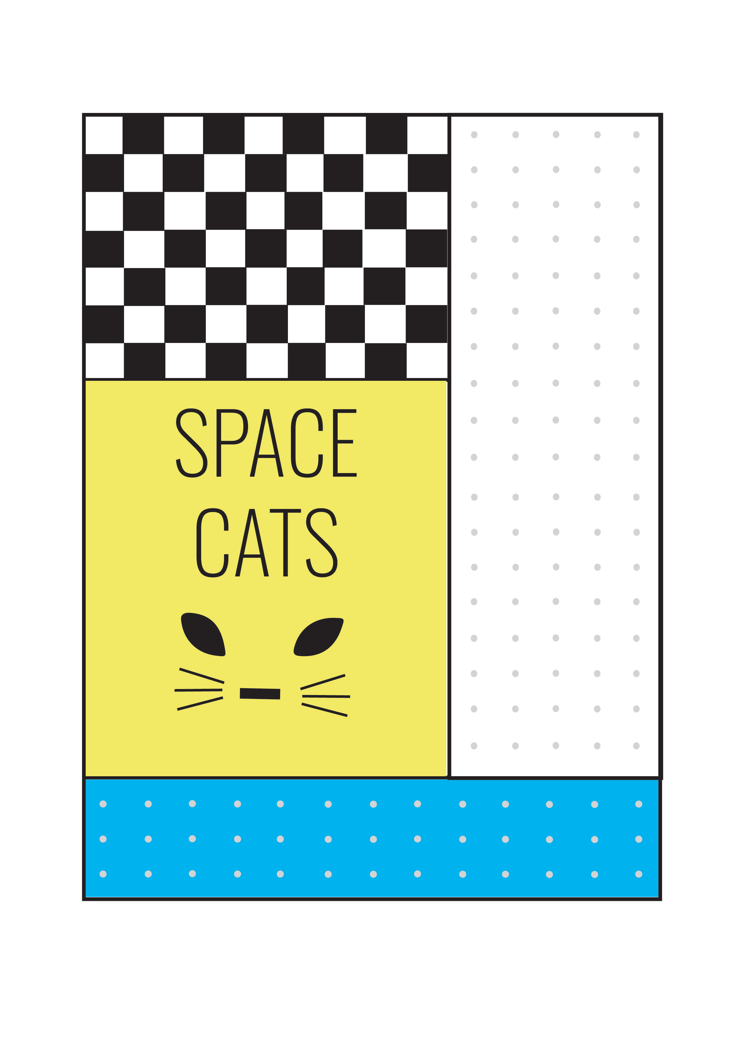
The basic form of the logo is a square.
The logo is made of strong and hard lines which brings forward its structural nature.
Scalability
• A good logo should be scalable, so as to suit any application (Kerr, 2018).
• Thus the logo was tried and tested at all scales and sizes before finalizing the design.

Application of Gestalt Principles
The gestalt laws of perceptual organisation explain human perception of seeing a structure as a unified whole. Gestalt theory is influential in logo design as it helps a logo to be recognisable and more memorable (Kerr, 2018).
There are six Gestalt principles: similarity, continuation, proximity, closure, symmetry and order and figure and ground. Out of the six, three have been used to make the logo effective:
• Proximity: close arrangement of thick, straight lines to create a group association, which can be noted in the logo. The boundary lines are thick, which only when put together form a shape of a square, but as individual line they don’t have any impact.
• Closure: The object is incomplete, but the viewer perceives a complete shape by filling in the missing information. As observed, the lines in the logo are not completely joined. But the shapes are placed in a manner that the viewer is able to fill in gaps.
• Symmetry and Order: The composition provides a sense of order. Both the sides of the logo are symmetric thus giving the whole logo a balanced look.
Provided Colour Palatte
Blue and yellow colour have been used as primary colours because as a brand the design- er wanted ‘Spacecats’ to portray a happy and quirky image.
The font ‘Oswald’ has been used to write the name of the brand. The font is used because it doesn‘t grab to much of the viewer’s attention, thus forcing them to look at the logo first.

Coloured Logo Variation
In addition to the black and white logo, the brand had a requirement for a colourful logo as well. thus I came up with variations that merged the previously made logo with colour and other elements.

Finalised Coloured Logo