So many reconciliations, so little time
Bill reconciliation is a critical component of power distribution companies, as every month they have multiple bills to verify and check. But the inability to fully automate is a pervasive challenge, thus many companies are still relying on manual processes. The costs associated with manual reconciliation can total in the millions, making increased automation a critically important operational and financial goal.
Brief: Create an online automated platform for the process of
electricity bill reconciliation.
Proposed Client NTPC (National Thermal Power Corporation Limited)
Sector Power, Electricity, Bill Verification Automation
My Role Research, Wireframing, Interface Design, Development
Time 3 Weeks
Type Independent Project
Talking To The Consumers
To understand the reconciliation process in detail we reached out to employees of the National Thermal Power Corporation Limited. We understood how long does it take for them reconcile one bill and what are employee hierarchies involved in the process.
Through the interviews we inferred that the assistant manager reconciles all the bills, whereas the general manager assigns the tasks and the chief general manager oversee the entire process. One bill can take up to 2 hours to get verified and monthly there can be hundreds of bills to check.
Moreover, the share of electricity in India's final energy consumption is set to rise from the current 17% to 24% by 2040, according to a key scenario by the International Energy Agency. Thus, there is a vital need to automate this entire process and our target audience for this project would be major power distribution companies like NTPC, Torrent Power, Reliance Power and Tata Power Company.
User Pain Points
In order to understand all personas who were part of this entire process a bit more, we spoke to the contact points multiple times. By doing this, we could also capture how they were using the current technologies and what value they took from it. We learned that currently most of them used Microsoft excel and manually put in the formulas and mark it as reconciled. Many a times to make a note of all their reconciliations they use pen and paper. Moreover they make all changes manually.
In order to understand all personas who were part of this entire process a bit more, we spoke to the contact points multiple times. By doing this, we could also capture how they were using the current technologies and what value they took from it. We learned that currently most of them used Microsoft excel and manually put in the formulas and mark it as reconciled. Many a times to make a note of all their reconciliations. Moreover they made all changes manually.
Some of their major pain points came forward were, the status of the reconciliation changed multiple times, throughout the month. That is the bill can be marked as variance detected (when there is a price disparity), sent to general manager for approval, still in process etc. The assistant manager had to keep a track of all bills and their statuses and keep updating it manually. Furthermore, in order to calculate bill variance one had to refer to three documents, that is the power bill, form 15 and the REA report (Regional Energy Account). Assistant manager had to refer all the three documents multiple times at different steps of reconciliation in order to get accurate results. Which required going back and forth multiple times.
Research
I also looked at other reconciliation platforms to further my research on what a useful dashboard is comprised of. Some takeaways of what made them successful included:
-
Well-structured navigation
-
Informative data that is actionable
-
Data presented in filterable timelines
-
Insights shown at different milestones and with visual representations
Main Objective
I determined that our main objective is to eliminate error-prone, manual tasks to improve your efficiency and effectiveness while reducing risk throughout financial close.
These features were important as they added a competitive advantage to efficient, accurate reconciliation, and would benefit organizations to prioritize process improvement through automation.
What Makes Digital Transformation of Reconciliation Challenging?

Eliminating costly, time-consuming, manual tasks from the reconciliation process is not as easy as it sounds. The primary roadblocks are inaccurate or inconsistent data transmitted by the senders, different file formats and patchwork systems. While standards have helped, many transactions still cannot be automatically reconciled due to mis-keyed data or the provision of unstructured data, such as transaction reference data submitted as memorandum or as PDF files.
Paper documents stubbornly remain integral to doing business in the modern era. Whether paying a claim or an invoice, checks and the identifiers on them are data elements critical to account and transaction reconciliation. Even when transmitted, those payment references are not universally standardized, making them difficult to verify and match to an account or transaction.
Starting With Questions ?
How I created a list of ‘How Might We…’ questions to help us better
align our user’s tasks and goals:
- How might we provide an experience that is engaging and valuable to our users?
- How to make the proposed platform in a way that they accept it as early as possible?
- How might we allow them to access their most critical information through their system?
- How to standardize the system for the entire organization ?
- How might we provide a tailored experience that allows organizers to see what’s most important to them?
Key Insights
- Users currently favoured to do the reconciliation process manually or on excel.
- They did agree that it took a lot of time and the current process was definitely prone to a lot mistakes.
- Nonetheless they were not in favour/hesitant to change their approach.
- Currently all communication and task allotment is done online, which increases the turn around time a lot.
Experience Requirements
- Navigation: Dashboard must be easy to navigate and data visualization must be easily digestible.
- Personalization: Users want the ability to personalize the data being displaced on the page.
- Personalization: User should have the ability to adjust what is being displayed and shared.
- Head-to head comparison: Allows users to easily compare data amongst each other.
- Easy to understand and can be used by non-technology savvy people efficiently.
Design Process
I ran a card sorting session and used this technique to determine which functionalities of the platform should stay, be relocated or be eliminated based on the platform’s information architecture and how much value it was adding on our dashboard and other pages.
Internal Feedback
I showed the finalised features to the team lead to quickly inquire what should be added or removed from the platform. The purpose of this was to discover potential quick wins on simple improvements that could be executed quickly.
"We need dispute reports, to be created on the platform itself, in case variance is found in bill amounts."
– Response from Internal Survey
Some more of the feedback I got back was:
1. There should be filter option on every tab, too make it easier for the user to sort the needed information.
2. All reconciliations should be shown on a monthly basis
3. A big feature request was the ability to export a report of any reconciliation that was done in the past
Proposed Journey Map

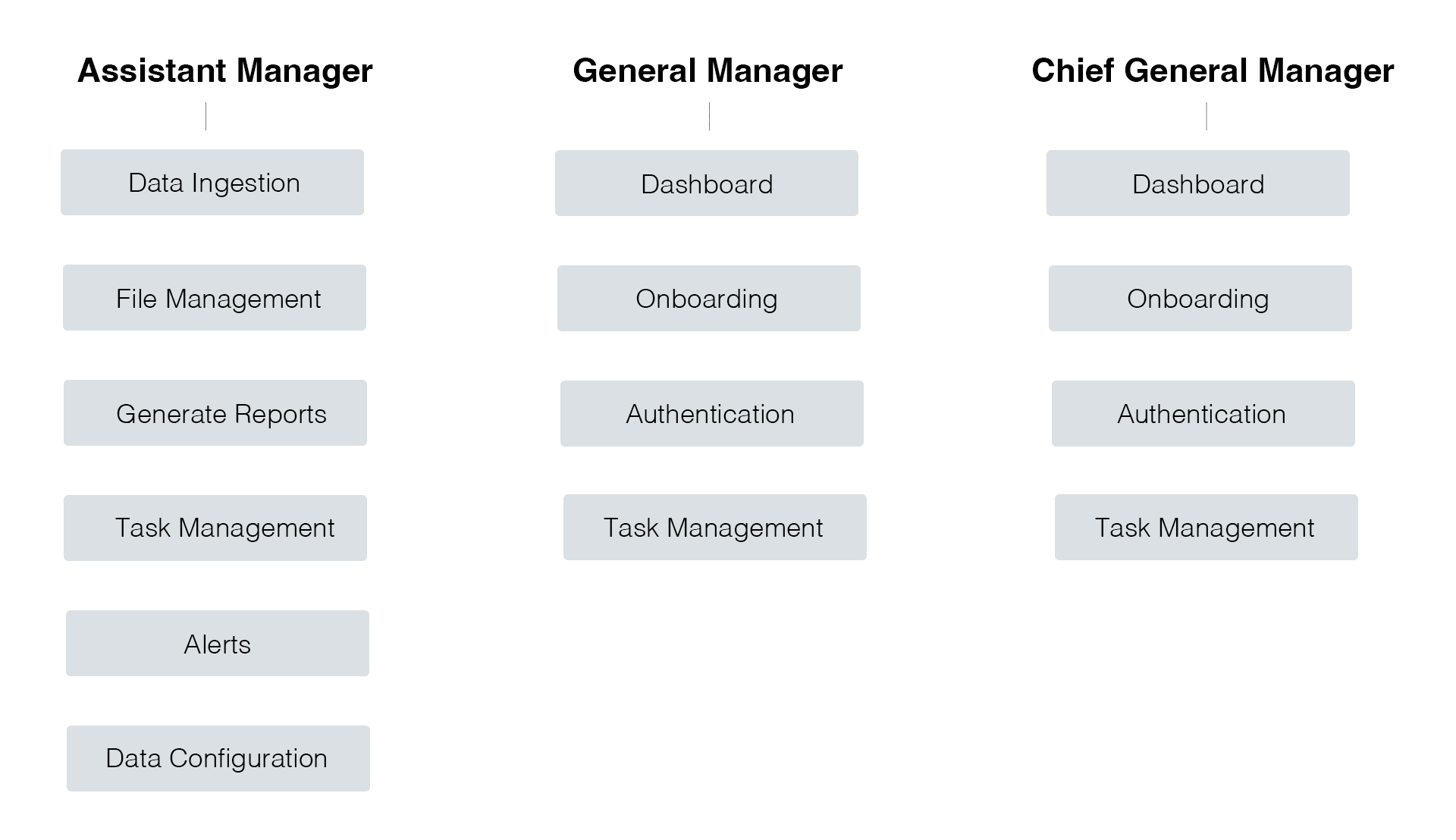
User Map
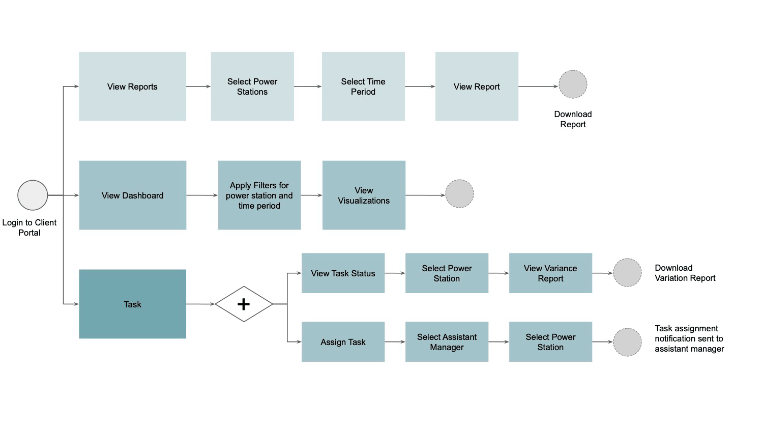
General Manager / Chief General Manager
Assistant Manager
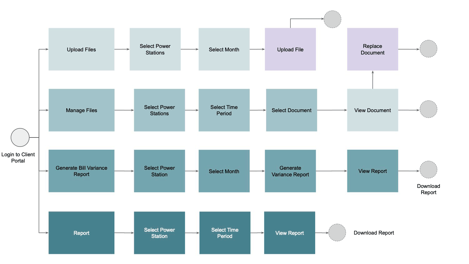
Assistant Manager - File Upload
The MVP
To validate these findings, I designed a simple list view of the reconciliation status and dashboard, the option to go through multiple tabs and sort information and removed a couple of features discussed in the ‘Card Sorting’ session.

Iterate, Iterate, Iterate
Based on my findings, I narrowed the focus into 4 areas for potential improvement:
1. Improve the data we provide
2. Improve navigation
3. Improve actionability
4. Improve notification
Improve the data we provide
In addition to the detailed information, overall status of multiple power plants should be visible. Display the data in a more visual way for it to be better digested and appealing.
Improve Navigation
I included tabs and maintained that consistency on all pages which allowed users to easily access different areas of a site and different parts of an individual pages. All the input spaces had the steps written on it which enabled the user to understand what had to be uploaded or the information that had be written.
Improve Actionability
Once the user finds variance, what should they do ? what happens when all documents are not uploaded ? what if there was a dispute ? I thought of a few ways to help guide and enhance the experience by prompting tips during different stages of reconciliation.
Improve Notification
How can we inform our users they’ve new reconciliations to undertake? How we notify them how many are pending and what is the deadline ? I worked on improving communication that would inform the user of activity milestones for their work.
First Set of Ideation


Second Set of Ideation

List Views

Type In Boxes
The Final Look


Challenges & Compromises
Unfortunately, one of our main challenges was the lack of money and time that we have day to day! With this challenge, we often have to reiterate our designs in order to be achievable within time and financial constraints, while still providing more value to our users.
-
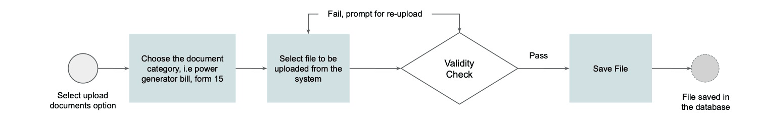
In one version, I wanted to include data configuration, where the user can change, edit, add formulas, which would make the platform more wholesome and can add multiple format of documents. But I had to scope it down to hardwiring three formulae which usually used into the system and the user just being able to upload pdfs.
-
Instead of adding a master database of different notification and emails that one can customise, I just provided them the option of choosing which notification they wanted to receive or send.