
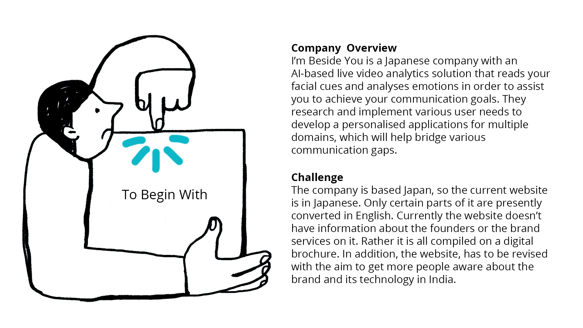
Company I'm Beside You
Brand Sector Artificial intelligence, Technology, Education
Visual Identity Casual, Quirky, Minimal
My Role Research, Wireframing, Interface Design, Development
Time 1 Week
Type Independent Project
T
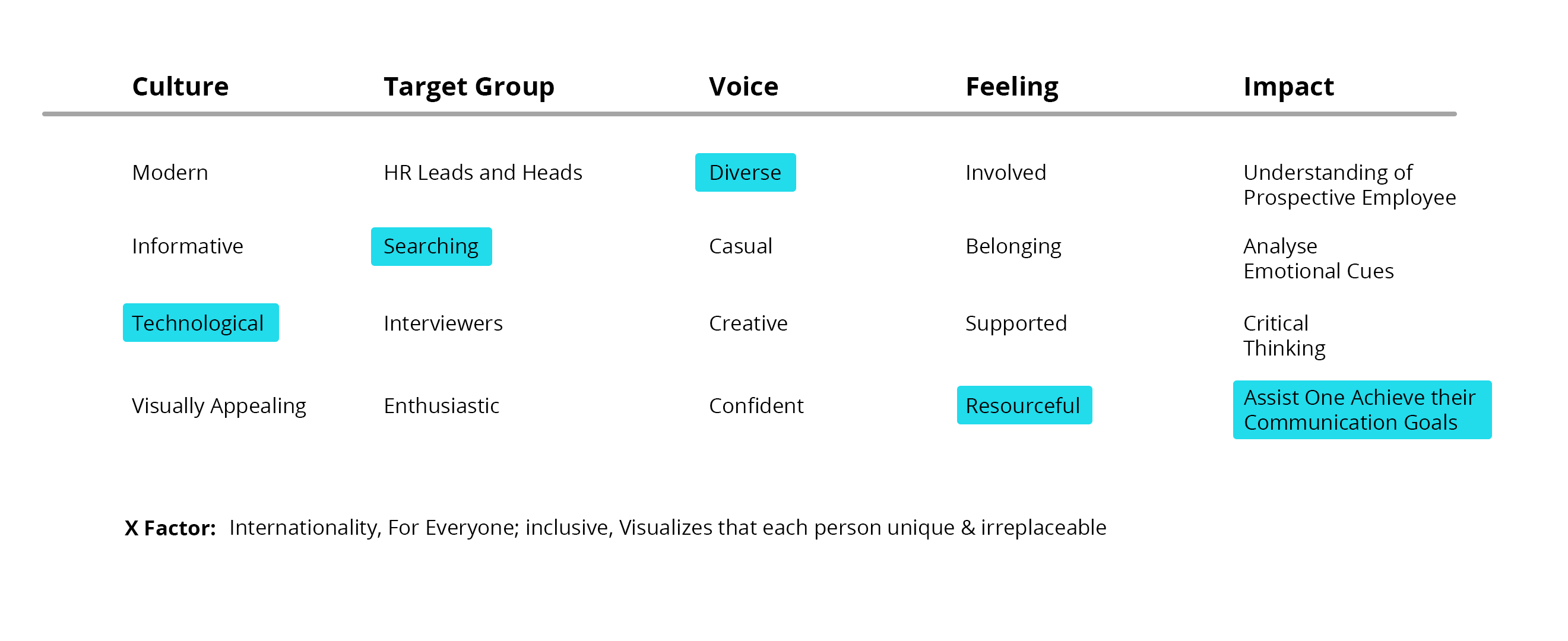
Brand Attributes
By brainstorming and prioritizing brand attributes in various categories I created the basis to put together a mission statement – this took about 30 minutes.
Culture: How should the viewers describe the brand?
Target: Groups How would I describe our target audience?
Voice: How do we want to sound to others?
Feeling: How do others feel after being in contact with the website?
Impact: What tangible impact do we have on others?
X-Factor: How are we different from others?
In this case, the main goal was to gather information and recreate the website design and to allow objective discussions about it.
SETTING GOALS
By brainstorming and prioritizing ideas in terms of efficiency and awareness, I quickly came up with a roadmap o the next steps, focusing not just on the website, but also on the organization itself – I believe that a strong organization is more likely to create strong products and services.
Why was a Redesign Needed?
-
The website is mostly in Japanese due to which, the brand’s presence in India is getting compromised.
-
Information was displayed in a way that poorly conveyed the use of the product, making many users not sure of the how the product worked.
-
The visuals were inconsistent, making the design cluttered and difficult to navigate.
Research
To help me understand how site users navigate and what factors influence their decision, I arranged face-to-face meetings and Skype calls to watch the testers while using the website. I gave them assignments and asked them to think aloud.
Results:
-
The subjects did not understand exactly what the product was.
-
The users didn’t want to download a brochure for all the information, rather they wanted it on the website.
-
The users had doubts about the creditability of the given information
-
The subjects have not understood what the specific activities of the organization are.
-
Some subjects found the home page texts to be too academic, saying they could not concentrate on the text for long.
-
The test subjects also looked at other subpages to find out about the activities but said that it was not of much help.
So how might we communicate their product information and goals in a more understandable way and how might we convey why the mission is worth supporting?
Possible solutions to gain understanding and build trust would be:
-
Clearly formulate the vision and mission and make it easily accessible.
-
Show concrete projects and success stories as a proof of activity and impact.
-
Represent supporters & partners for social proof.
-
Show organization founders and their backgrounds to improve credibility.
-
Explanation of what is being done exactly by the offered product and what are its impacts.
-
For questions give the possibility of direct chat.
Get Everyone on the Same Page
To get a rough overview of the process, it helped to build a very simple journey map. This was especially useful to communicate it to the viewers and my colleagues and have everyone on the same page.

Define Target Groups
In addition to actually conducting online interviews and tests, to empathize more with the different types of users, I also developed so-called proto-personas, which were based purely on experience and assumptions. They served as a starting point to reflect on the needs and challenges of the user and possible solutions that were considered later in building the information architecture.

Mr. Phil G Thomas; He is 36 years old, working in a multinational corporation, and post covid-19 pandemic this company has switched to working remotely full time. He’s noticed that during online meetings or interactions many a times his tone is mis-interpreted by others and vice a versa.
MOTIVATION – What do they care about?
He is very dedicated towards his job and values his connection with his family and friends.
FRUSTRATION – What challenges do they face?
The so called online culture has forced people to work almost all throughout the day. He gets extremely exhausted after a point attending all his online meetings. He is unable to comprehend the information being discussed in the meeting due to many of the distractions in his house. For instance his dog and children. Moreover, since his job is very demanding he struggles to take out time for his family.
GOALS – What are they trying to accomplish?
He wants to make the experience of his online meetings more enjoyable. Since he spends most of his day attending meetings he wants to make sure he stays attentive throughout all of them. He is looking for a product to help him with the same. He also wants to manage his work life balance.
Ms. Rose Phillip; She is 28 years old. She is a litigation lawyer and works from her home. She has her own practice. She has multiple conversations with her clients throughout the day both online and offline and is looking for a solution to make her online experience better .
MOTIVATION – What do they care about?
She is extremely passionate about supporting others and is constantly looking for new ways to help people around her. She is extremely empathetic, observant and tries her best to be fair towards all. She wants to understand all her clients as much as possible, in order too help them to the best of her capabilities.
FRUSTRATION – What challenges do they face?
Many a times her clients lie to her, in order to get her on their side. If not lie, some try to hide things or tell her incomplete stories. She has clients from all over the country, thus she has no option but to provide online consultations.
GOALS – What are they trying to accomplish?
She wants get justice for all her clients and be fair to them irrespective of what they do. She expects her clients to be honest with her and is looking for a solution for the same. She wants to be known as a credible lawyer, who is trustworthy and efficient. She wants to have the following reputation - nothing can go past her.

Story-Boarding
Shown is comparative glimpse of the old and redesigned version of the website. Some of the key changes include improved information architecture as well as a minimalistic design with consistent visuals.
The Redesign
Before:
After:
The Design Process
- Content Audit
PREVIOUS STATE
I started off the project by mapping out the current information architecture of the website and worked to change the layout of information in a way that is more intuitive and user-friendly. In blue are the pages of the website, and below them the sections of the corresponding pages outlined. This was done in order to ensure that once the user visits the site, they can find the information they need quickly and in an easy to understand manner.

NEW STATE
After the analysis of the current website state, it became apparent that the website would benefit from a restructuring. Outlined in purple are the sections that I moved, and in pink are the sections I added to further create an intuitive and easy to navigate website. For example, I noticed from my research that users were having difficulty understanding how the product works, thus I added separate pages for it, so that they can easily find out more information about how to use the product.

EVALUATION VIA TREE TESTS
To ensure an intuitive understanding of the site‘s structure I tested the sitemap on-site with potential users through so-called tree-testing by giving them relevant tasks, such as "Where would you click if you wanted to see who are thee clients?" Based on the test results, the sitemap was adjusted accordingly.
Learning
To make sure that the redesign isn‘t based too much on old content respectively to gain a fresh point of view, I added one or two extra steps in the future:
-
Rather than diving straight into the results of content auditing and building the new site based on the old content, it makes sense to challenge the group to list all of the content areas that they remember – without, of course, visiting the site. If anything is missing, this is a good sign to question whether these contents really need to stay in the new design.
-
Create more stakeholders (proto-personas, 3-6) and think about what they need from the site before diving into the old content – and finally add what's important to the organization, too.
Laying Out The Content
After identifying the updated content structure for the website, I began wireframing how this content could be put into sections. The focus for this exercise was to showcase the content in a way that met both business goals (getting users to get aware about the brand and its products) and user goals (gaining an understanding of how the platform works). Once the layout was identified in a way that prioritized important content and created a user friendly experience, I dove in to high fidelity designs to focus on the visuals.


The Final Look